
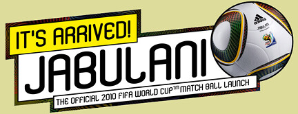
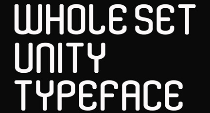
Today is the font that is moving as the winner of the Cup World Cup 2010 and if Sunday's selection of Spain beats the Dutch. Yesterday they played against Germany, typographer who commissioned the Yomar Brazilian Augusto. The Unity is the font that you can find in the ball being questioned in the history of the world. It was also used by several Latino selections, such as Paraguay, Mexico and Argentina, were on the road without glory. I already had advanced to the typography of winning that tournament came Adidas typographical hanging of the shirts.
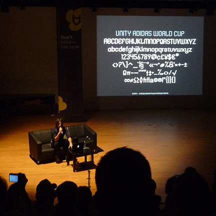
then the entire talk Yomar Augusto, exclusively for Visually.
1 - Or Dizer o nascimento da typography Unity? Unity
Projetos e foi desenvolvido em period not trabalhei na Agência 180 Amsterdam, who kept ADIDAS account for more than a decade.
Detail, the design department of 180, developed the visual language of football brand segment. The typography was an essential part of the project, serving as a central pillar of the visual identity for the communication of Adidas World Cup 2010 in South Africa
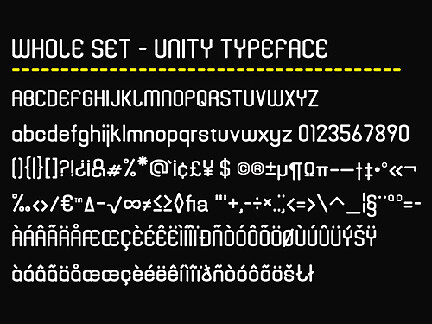
The development of typography UNITY began with sketches and a few letters coming directly from the designers at Adidas . All development and subsequent development of the alphabet has been designed within the 180 Amsterdam. The font is inspired by the triangular element that is printed on the official ball of the World Cup, and our goal was to give life and personality to the alphabet.
2 - How long is your design?
The project was developed in three months.
3 - What were the main obstacles that arose during the process?
The relationship between Adidas and 180 Amsterdam was very important during the construction of the source, with both parties working together and bringing important issues to be judged and analyzed. This factor contributed significantly in the collaborative outcome.
4 - The fonts are designed on the basis of subsequent applications. Maybe a fountain designed for a football shirt that we could talk about the personality of a selection. What personality should have the option of taking the Unity? At first the
UNITY was designed only for use on the shirts of the players during the cup, but with the development of the project was implemented in the source of all communication during the Adidas Cup. The figures were the first to be drawn, followed by the letters, which are most important in the alphabet during the World Cup. The expansion of the tiny and all other elements were developed for use in all communication Adidas between point of sale, packaging, advertising, films, print and digital communications.
5 - So that's coming?
The development of typography UNITY began with sketches and a few letters coming directly from the designers at Adidas. All development and subsequent development of the alphabet has been designed within the 180 Amsterdam. The font is inspired by the triangular element that is printed on the official ball of the World Cup, and our goal was to give life and personality to the alphabet.
6 - If we talk about the influences in its creation, I think there are some points of contact with Industry (Neville Brody). Do not you think?
How come the initial designs of the designers of Adidas, and the development and subsequent development of the alphabet has been designed within the 180 Amsterdam. Brody does not foi referência. Maybe subconsciously. ;)
7 - é chamada Why Unity? União
between you jogador.